A few weeks ago, a friend connected me with a local nonprofit — Equus Charities of the Lowcountry. They host charity polo matches in Bluffton, SC that raise money for organizations like Heroes on Horseback, a therapeutic riding center for veterans, kids, and adults with disabilities.
The problem? Their biggest event of the year was coming up fast, and their entire web presence was a Ticketbud page. No website. No brand online. No way for people to learn about them, read their mission, or find event details without clicking through a ticketing platform.
They needed a real website. And they needed it now.
The Challenge
Here's what I was working with:
- Timeline: One week to design, build, and launch before event promotions ramped up
- Budget: Nonprofit budget — every dollar matters
- Content: Minimal. A handful of event photos, a few board member headshots, and the rest I'd need to write or source
- Ticketing: Already using Ticketbud — needed to integrate, not replace
- Tech requirements: Contact form, event details, gallery, board of directors, sponsor section, FAQ, donation integration
Oh, and it had to look like a $5,000 site on a fraction of the budget. Because that's what their audience — the Lowcountry polo crowd — expects.
The Approach: No Framework, No Nonsense
I didn't reach for WordPress. I didn't spin up a React app. I didn't install a single npm package for the frontend.
I built it the way I build every client site: clean HTML, CSS, and vanilla JavaScript. One page. Ten sections. Zero dependencies.
Why? Because nonprofits don't need complexity. They need a site that:
- Loads fast on any device
- Costs nothing to host (Netlify free tier)
- Doesn't break when nobody's maintaining it
- Looks polished enough to build trust with donors and sponsors
A static site checks every box. No databases to manage. No plugins to update. No security patches at 2 AM. Just files on a CDN, served instantly to anyone who visits.
Design Decisions That Mattered
The Color Palette
The client had brand colors — navy, green, brown/gold, and gray. But slapping those on a white background would've looked corporate, not elegant. I pulled inspiration from their brand and built an extended palette with cream backgrounds, warm gold accents, and navy typography. The result feels editorial. Magazine-like. Appropriate for a polo event.
Typography
Playfair Display for headings. Lato for body text. Serif meets sans-serif. Classic and readable. Both self-hosted — no Google Fonts CDN calls slowing things down.
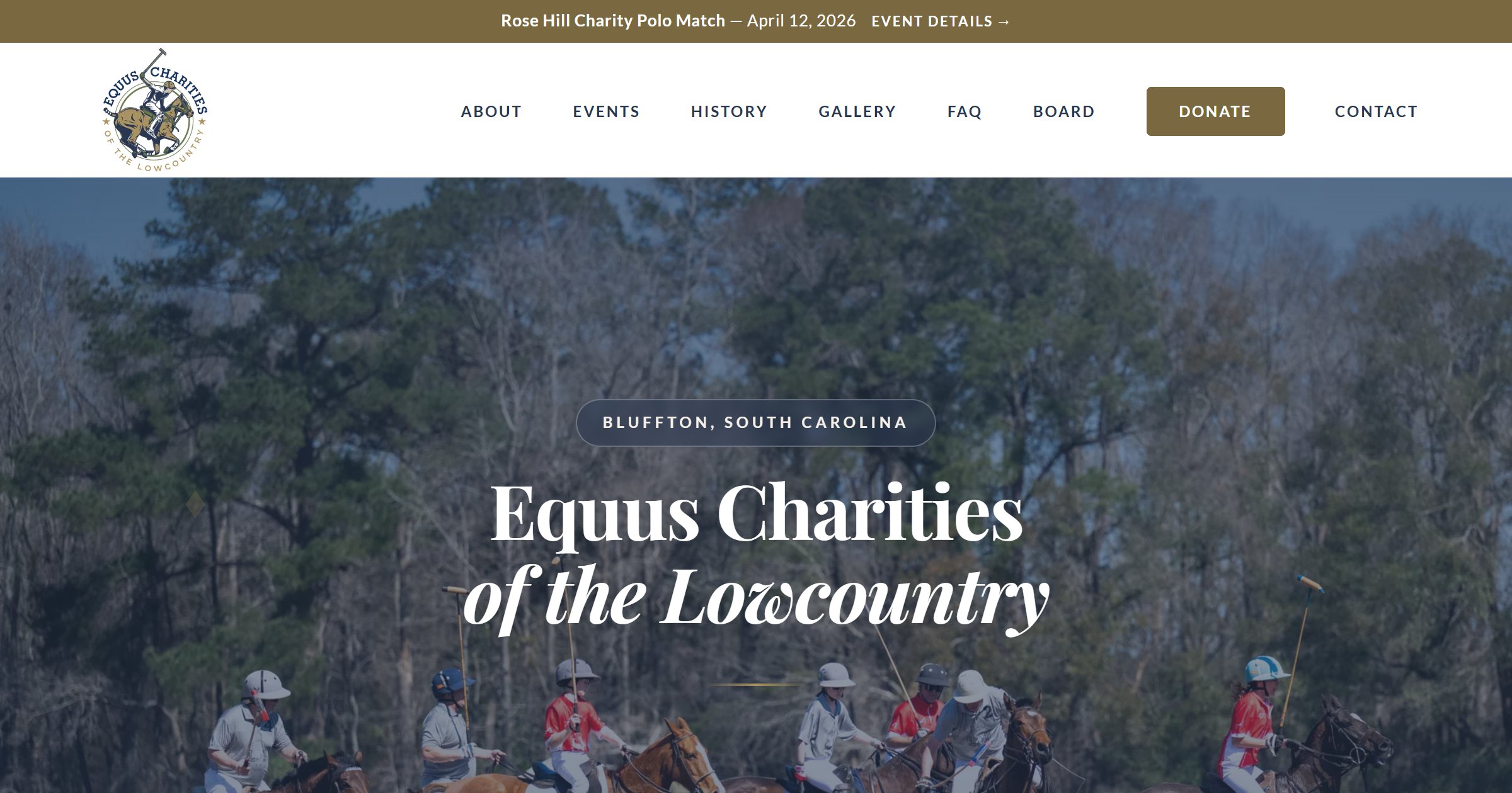
The Hero Image
This was critical. The hero needed to immediately communicate "polo" and "Lowcountry" without a single word. I used a real action shot from a previous match — riders mid-swing, dust in the air, oaks in the background. One image, and visitors know exactly where they are.
Single-Page Architecture
For a nonprofit with one major event, a single-page site makes more sense than a multi-page site. Everything the visitor needs — mission, event details, tickets, contact — is one scroll away. No clicking through menus. No getting lost. Just a smooth downward journey from "who are they" to "take my money."
The Tricky Parts
Ticketbud Integration
Ticketbud offers an embeddable JavaScript widget for ticket sales. Great in theory. In practice, it loads 268KB of third-party assets including jQuery, has no cache headers, and hijacks the page scroll position on load. I had to override scrollIntoView temporarily to prevent the widget from yanking visitors down the page when it initialized. Not glamorous work, but necessary.
Content From Scratch
The client had minimal content ready. I researched the history of polo in the Lowcountry — turns out it started in 1974 at Honey Horn Plantation on Hilton Head Island. I wrote the About section, the history section, and the FAQ based on conversations with the board and public records. A web designer who can write is worth their weight in gold for projects like this.
Performance and Security
This isn't the kind of thing most clients ask about, but it's the kind of thing that separates a professional build from a DIY site:
- Self-hosted fonts — no external CDN calls
- WebP images throughout — smaller files, faster loads
- Responsive hero image — desktop gets the full photo, mobile gets a compressed 30KB version
- Security headers via Netlify — HSTS, content type sniffing protection, referrer policy
- Honeypot spam protection on the contact form — plus Cloudflare Turnstile for bot prevention
- Contact form backend — Netlify Function with Resend for email delivery. No third-party form services.
- Lighthouse scores: Desktop 97. Accessibility 93. Best Practices 100. SEO 100.
The mobile performance score sits around 62-65, almost entirely because of the Ticketbud widget's 268KB payload. Our own code is under 50KB total. Sometimes you can't control the third-party tax.
The Launch
DNS pointed. SSL provisioned. Contact form tested. Analytics tracking. Search Console submitted. OG images verified for social sharing. All in one evening.
The site went live at equuscharities.org — four days before the Rose Hill Charity Polo Match. The client had a professional web presence for their biggest event of the year, with zero monthly hosting costs and full ownership of every line of code.
What I Learned (Again)
Every project reinforces the same lessons, but they're worth repeating:
- Simple tech scales. HTML, CSS, and JS aren't exciting. They're also the most reliable, fastest, and cheapest stack you can deploy. For a nonprofit that needs to stay online for years without maintenance, that matters more than any framework.
- Content is always the bottleneck. I can build a full frontend in days. But waiting for headshots, bios, logos, and copy? That's where timelines stretch. If you're hiring a web developer, have your content ready before they start.
- Nonprofits deserve good design. A charity's website is often the first thing a potential donor sees. If it looks like it was built in 2012, that donor might question where their money is going. A polished site builds trust — and trust drives donations.
- Third-party widgets are a performance trap. The Ticketbud embed works great functionally, but it tanks mobile performance scores. Always weigh the convenience of an embed against its cost to page speed.
- Launch fast, iterate later. The site went live with placeholder bios and missing headshots. That's fine. A live site with 90% of the content beats a perfect site that launches after the event.
The Result
Equus Charities now has a site that tells their story, showcases their mission, sells tickets, accepts donations, and looks like it belongs next to the organizations they partner with. All for zero dollars a month in hosting.
If your nonprofit or small business needs a website that actually works — one that loads fast, costs nothing to maintain, and makes people trust you the moment they land on it — let's talk or call me at (843) 619-7394.